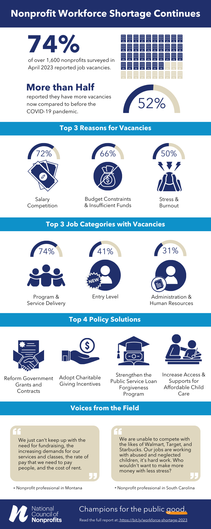
A picture may paint a thousand words, it is said, but an infographic can go even farther using pictures, numbers, AND words to paint the bigger picture, tell the full story. Effective infographics can “illustrate” the presented information, communicate complex data into understandable images, and break things down into bite-sized concepts that can convert theory into action. Take, for example, the newly released infographic, Nonprofit Workforce Shortage Continues, which condenses a 43-page report issued last week by the National Council of Nonprofits.
The recent report from the National Council of Nonprofits, 2023 Nonprofit Workforce Survey Results, analyzes the survey responses of more than 1,600 nonprofit professionals, presents scores of data points, provides quotes from nonprofits in more than 25 states, identifies 10 causes for workforce shortages, and offers nearly three dozen practical and public policy solutions – all in a 43-page report.
Clearly, some consolidation and prioritization are needed to make the point to nonprofits, the public, reporters, and policymakers that the nonprofit sector is suffering a crisis that affects everyone and immediate action is needed.
The infographic, Nonprofit Workforce Shortage Continues, is one tool (social media messaging and PowerPoint presentations being two more) for helping people get to the point quickly. It tells the key stories of the data and testimonials in five clear panels. It leads with graphics and text demonstrating the depth and duration of the problem of workforce shortages in the charitable nonprofit sector. Next, it identifies the “Top 3 Reasons for Vacancies” with graphs and icons (the one for Stress and Burnout is our favorite).
Readers need to know the shortages and causes aren’t lumped into one amorphous aggregation. For that reason, the third section of the infographic points to the “Top 3 Job Categories with Vacancies” – program and service delivery, entry level, and administrative/human resources. The icons selected for the infographic personalize the challenge.
Next comes “Top 4 Policy Solutions” that simply and clearly show that there are ready answers to the question: what can we do about it?
The infographic closes with “Voices from the Field,” in the form of two quotes from professionals in Montana and South Carolina that tell of the personal experiences of nonprofits struggling to cope with workforce shortages while attempting to maintain or increase services to the public.
Why take the extra time to create an infographic? The human brain processes images 60,000 times faster than text, and 90 percent of information transmitted to the brain is visual. When the information is packaged in a form that can be quickly understood, the audience can quickly move from processing to action.
Here are a few little tips for painting the Bigger Picture:
- Use a limited amount of font types, weights, and colors. Too much variation can distract the reader.
- Be clear with what you want from your intended audience. And then design for them.
- If for other nonprofits, then include memorable data points with visuals to drive home the information.
- If for policymakers, give them policy changes that will support your goals – with images, figures, and words that are crisp and clear.
- You don’t need to be a graphic designer to get started: Canva Templates - great for when you have statistics on hand that you want to craft into narrative; Flourish – when you have data on hand and want to make interactive graphics.
Now, here are some additional examples for inspiration:
- Adding Up Impact: Nonprofits Work for Maine, Maine Association of Nonprofits. Indeed, the state association of nonprofits’whole website reflects the best practices of infographics and communications.
- Nonprofit Workforce Shortage in Tennessee, Momentum Nonprofit Partners, utilizing data from the Tennessee-specific data from the national 2023 Nonprofit Workforce Survey Results.
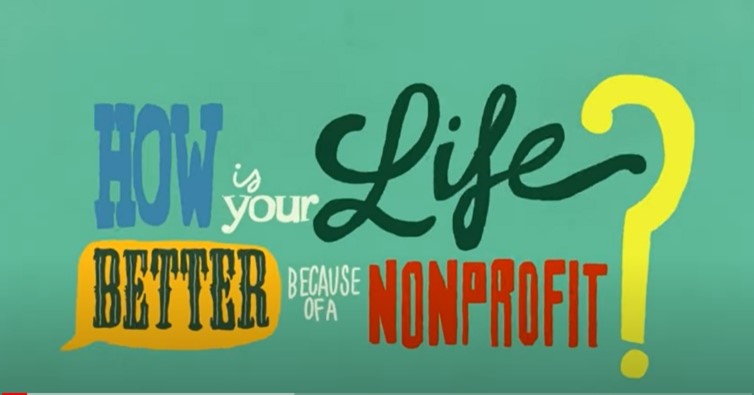
- The Classic Motion Graphic: How Is Your Life Better Because of a Nonprofit? (0:01:17), Nonprofit Association of the Midlands. Not really an infographic – more like an infographic on the go – but you get the point.